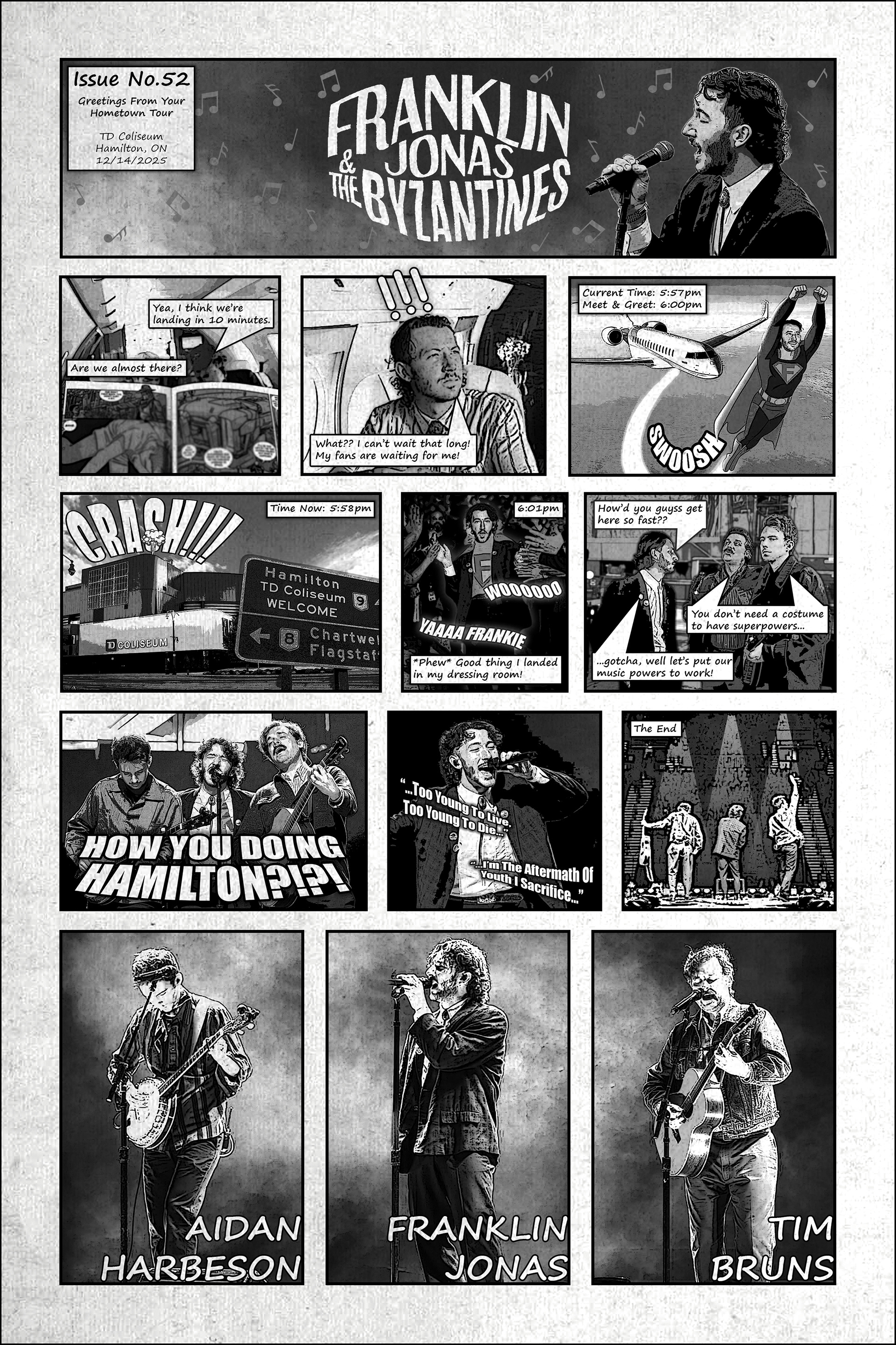
This poster was designed as a playful blend of Franklin Jonas’ love for comic books and the connection he shares with his fans.
Inspired by vintage comic strips, the piece uses panel-based storytelling, halftone textures, hand-drawn typography, and monochromatic imagery to recreate the feel of a printed comic issue while documenting the band’s stop in Hamilton. The narrative follows Franklin racing to make it to the venue in time for the show, turning a traditional concert poster into a lighthearted superhero-style story filled with references to the band and their fan community. By combining concert photography with comic-inspired graphics and humor, the design was created to feel personal, interactive, and celebratory of both the music and the experience shared between the band and their audience.
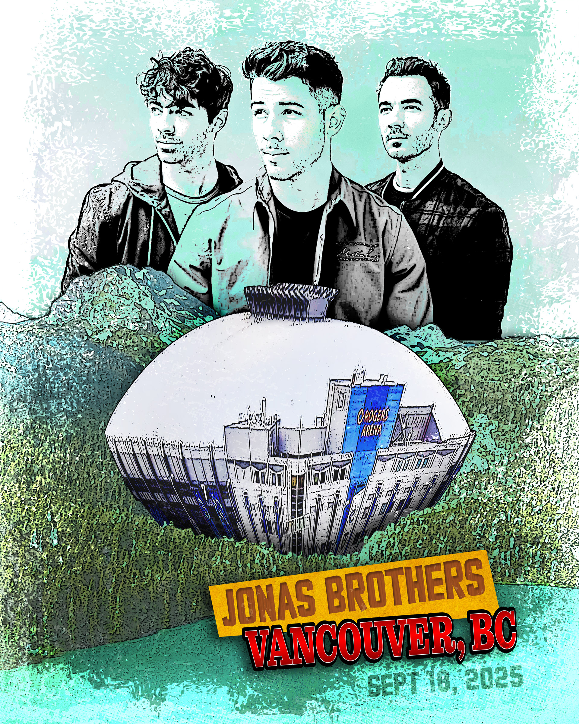
I was hired to design a custom poster for The Jonas Brother's concert that was Vancouver specific.
To capture the essence of Vancouver, the composition is grounded in its iconic forests and blue waters, with Rogers Arena emerging naturally from the wooded landscape. The Jonas Brothers’ connection to the city through their Camp Rock era inspired the poster header, which references the original film’s title typography and design. The trio is positioned in the sky overlooking the scenery, blending into a soft blue atmosphere that enhances the painted, dreamlike quality. Rendered in a watercolour style throughout, the piece combines these elements into a cohesive, whimsical interpretation of Vancouver.
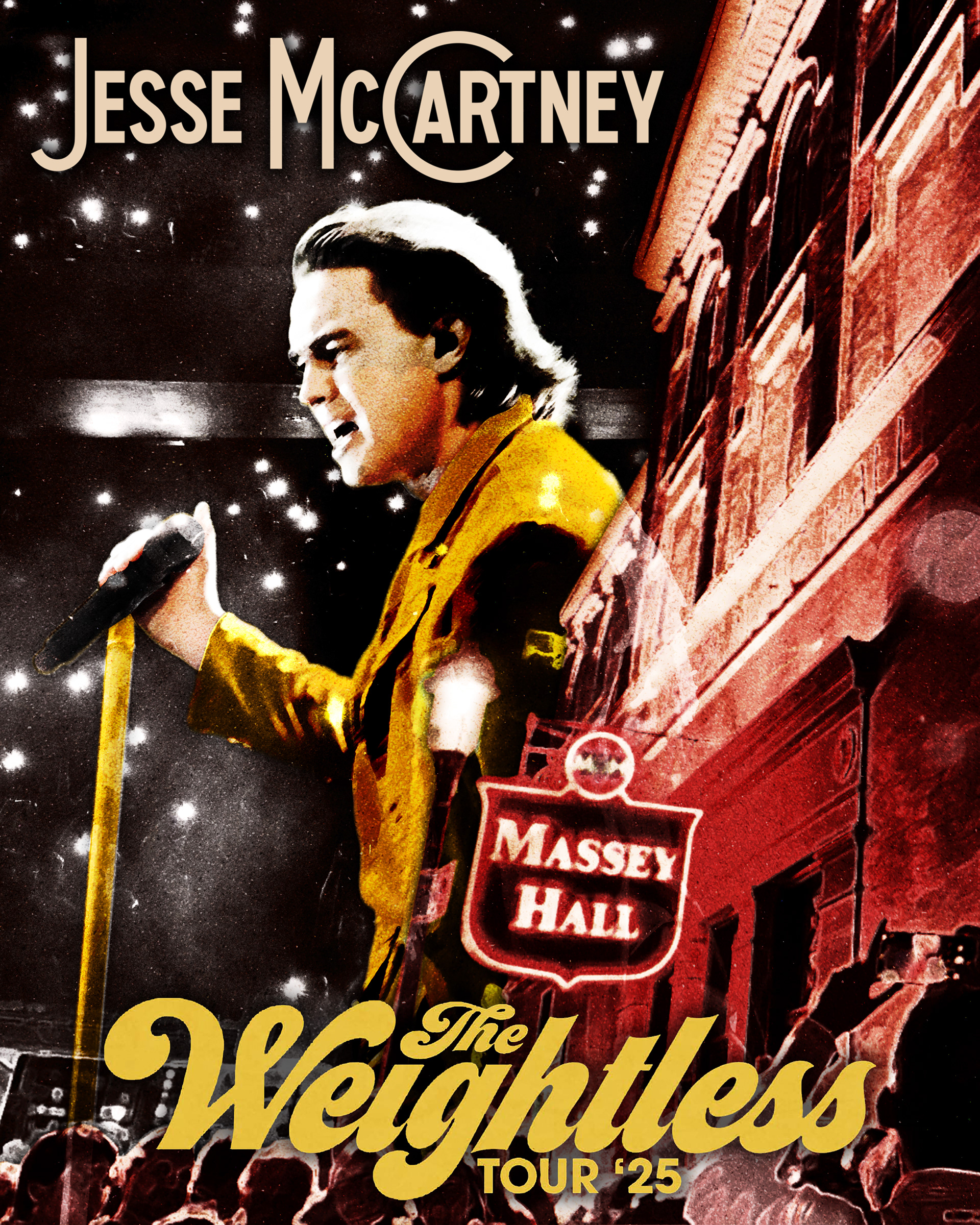
When Jesse McCartney came to Massey Hall, I wanted to design a venue specific poster to celebrate his stop at the historic hall.
This poster uses an overexposed, washed aesthetic to reflect the long and storied history of Massey Hall, while introducing richer colour to ensure the key elements remain visually clear. The building is positioned along the right edge of the composition, with Jesse emerging from behind it to create a dynamic, icon-like interaction between subject and setting. Rather than a flat black background, a saturated concert photograph is used to reference his live performances, with flashes of phones and cameras adding energy and a sense of scale. Together, these elements create a grand, atmospheric composition that ties performance, place, and legacy into a unified design.
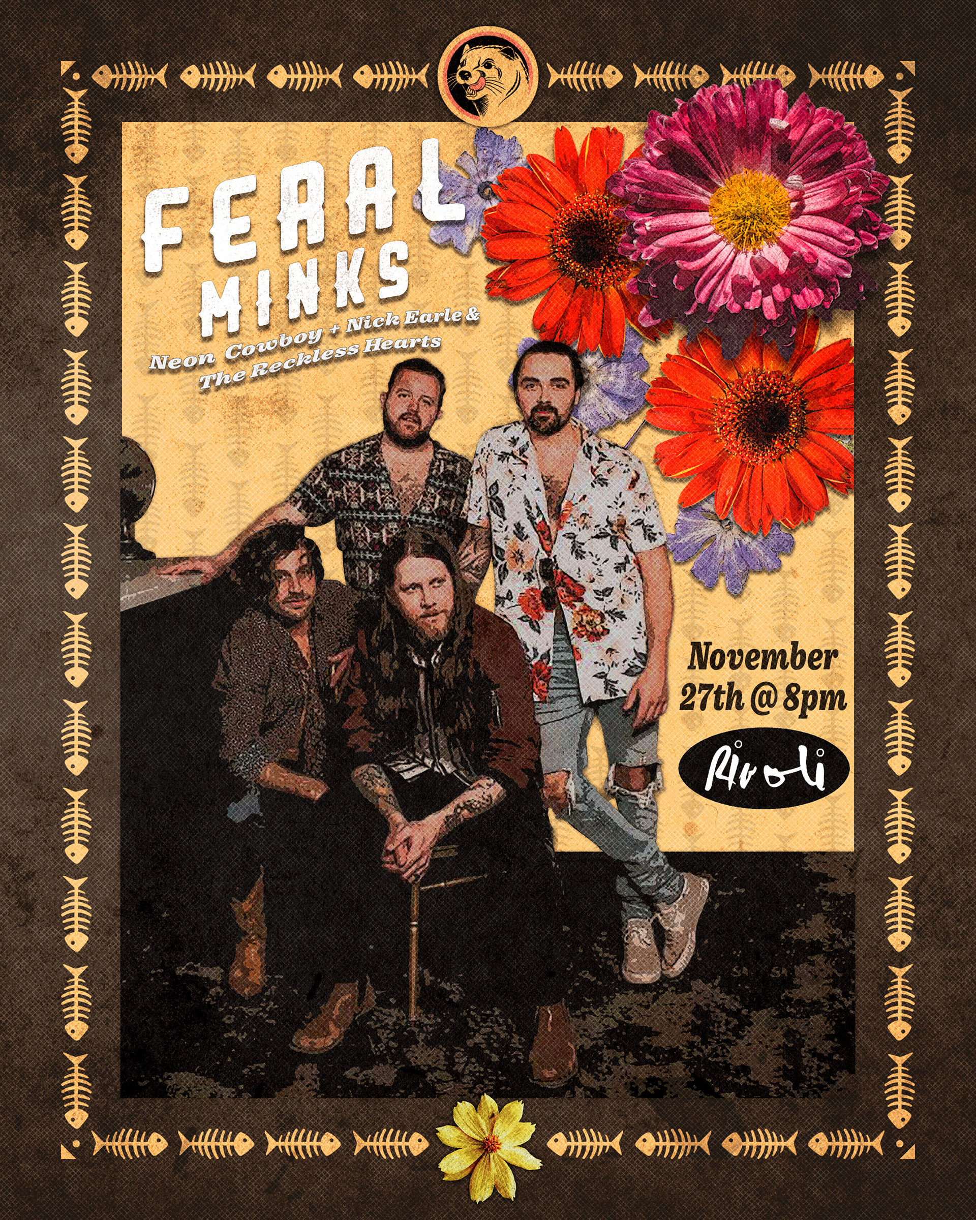
Designed for a Kitchener Ontario band, I wanted to help promote Feral Minks' upcoming show in Toronto.
This poster for Feral Minks was designed around the band’s single “Saving Dead Flowers,” using elements inspired by the cover art to create a strong visual connection between the music, the band, and the live show. The floral imagery and warm earthy colour palette were incorporated to reflect the organic, slightly vintage tone of the single, while the textured background and distressed details help give the poster a worn-in, handcrafted feel. Decorative borders and layered collage elements were used to frame the band and create a balanced composition that feels both intimate and expressive. By tying the visual identity of the single into the concert artwork, the piece was designed to feel cohesive and immediately recognizable to fans.
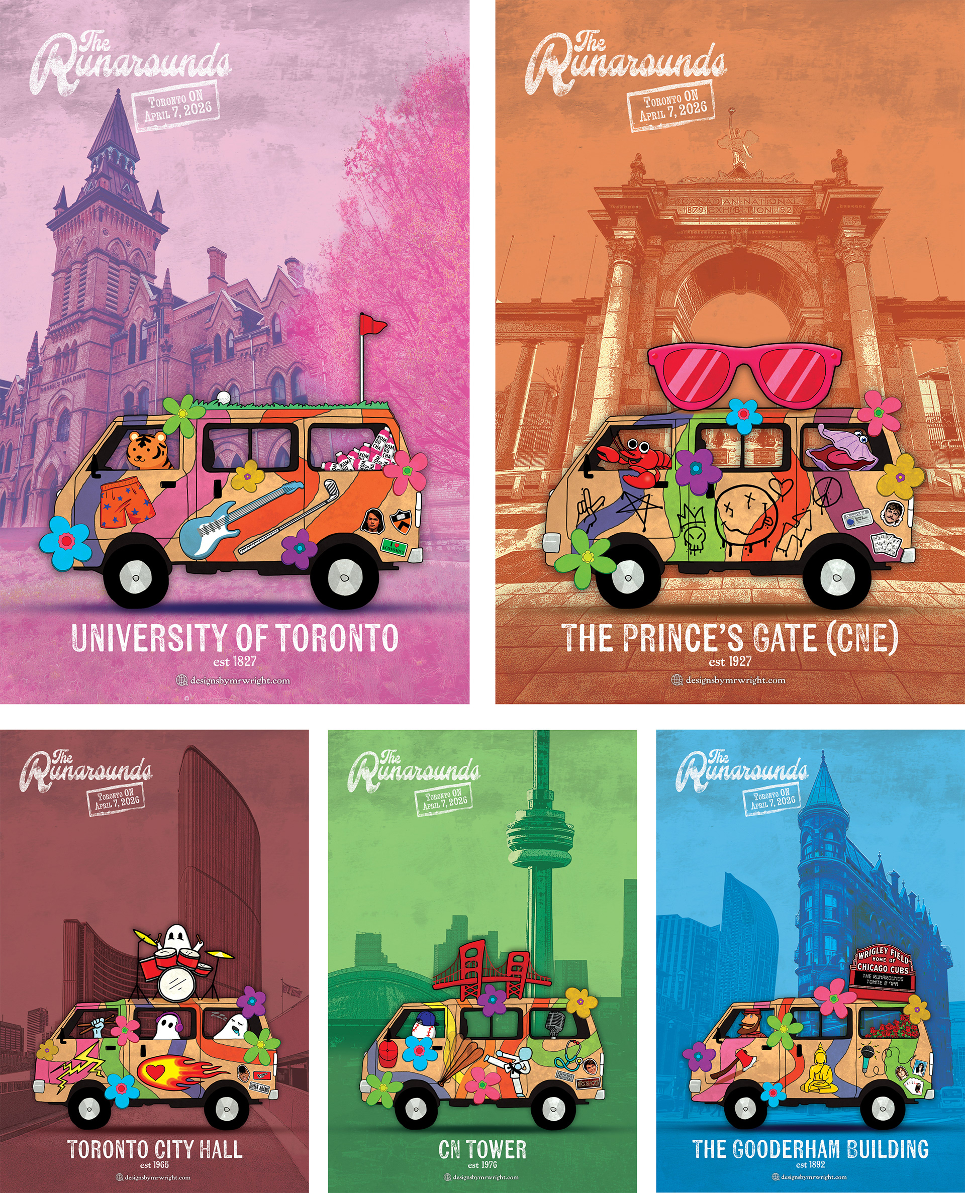
The Runarounds are a new, young band and they were performing for the first time in Canada so I wanted to present them a special poster customized for each band member.
his series of five custom posters was designed around the band’s “Minivan Tour” theme, with each piece tailored to an individual member. Every van features personalized details inspired by the member’s solo work, hometown, personality, and hobbies, rewarding viewers with small visual references and hidden jokes the closer they look. Iconic Toronto landmarks were incorporated into each background to celebrate the city’s identity while creating the feeling of travelling through Toronto alongside the band. Distinct colour palettes were also used across the series to give each poster its own personality while helping differentiate the members and their custom vans.